“The identity was inconsistent across different medias and proving difficult”
The brand consultant responsible for the redesign of Yeovil Town Football Club badge has explained the reasoning behind the new look as he looked to reassure fans of the National League South side.
Chris Payne has spoken exclusively to Somerset’s Alive! about the major rebranding of the club and the process that was followed to enable the new design, saying that fans were involved in the process and made their choice with the badge which was unveiled by the football club on Tuesday.
Speaking from the United States, where Chris is currently based, he started by speaking about the design brief he was given by the football club and the reasons why the changes were made.
Chris said: “It was fairly open. The club wanted to modernise its identity as they realised the [badge] wasn’t working in many practical environments , the identity was inconsistent across different medias and was proving difficult at different sizes – when big it worked, when small it didn’t, you lose a lot of detail.

“The previous identity was not quite right for a club that was looking to progress and it was one of those things where it had fell behind the times. It worked really well back in the day but it was proving to be problematic with the production of it.”
Chris added: “There wasn’t a set creative brief but it was more, let’s listen to the fans and do a survey, let’s have some listening sessions with the fans for their guidance, so that’s what we did and they informed the design.”
Fans took to social media to share their feelings about the new badge and Chris said that it is understandable that some would find it difficult to accept the new look.
Chris continued: “There’s a lot of nostalgia with football clubs and their identities and can understand [the backlash] as change is difficult, especially when it is quite a radical change. It was done with the idea of progressing and living up to modern standards.
“We asked fans about it beforehand and what’s your thoughts on it. People said that St. John the Baptist didn’t have any place in the identity. We play in green and white so why is their yellow in it and people didn’t understand what the things were in the middle.”

Chris pointed out that it was the fans who had chosen the design after a number were presented on a shortlist.
He pointed out: “It was the fans who backed up Martin [Hellier], the chairman’s, ideas about wanting to evolve it. So we asked fans about what we currently have and how it could be improved.
“We had a listening session at Huish Park and showed the fans three different options and over 90 per cent chose the one that you see now. Social media is a thing and can be a bit poisonous at times but every club that has rebranded will experience the same with many jumping on the bandwagon.”
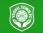
In a statement shared on Yeovil Town’s website, the details of why the changes have been made were explained. The statement reads: “The gloves hold a special place in the hearts of Yeovil Town fans, earning us the affectionate nickname ‘The Glovers.’ This moniker not only reflects our town’s heritage but also embodies the spirit of teamwork, unity, and determination that defines our club.”
- Yeovil Town Football Club badge designer explains changes and reassures fans
- Yeovil Town F.C. responds to fans after new badge reveal
- Weston’s Jake Cornish to ‘reunite with ex’ on Love Island All-Stars

The statement continued: “At the heart of the new badge lies a tribute to the club’s founding year, 1895, encapsulating the traditional values of football that have guided Yeovil Town throughout its illustrious history. This inclusion serves as a proud reminder of the club’s enduring legacy in the world of football, honouring the pioneering spirit of its founders and the dedication of all those who have contributed to its success.
“In designing our new badge, we sought to capture the essence of both our footballing tradition and our town’s proud history. The gloves and the ball serve as a powerful symbol of our identity, uniting past and present in a dynamic emblem that resonates with supporters young and old.”

Leave a comment